HBO Max TV App
HBO Max is a streaming service designed to connect viewers to quality content they enjoy. Services like these provide entertainment to subscribers who find the content they consume to be a destresser in their day-to-day lives.
Role
UX Research & Design
User Interviews
Affinity Diagrams
Empathy Map
User Persona
Problem Statement
Ideation
Feature Prioritization
User Journey Map
Competitor Analysis
Task Flow
User Flows
Wireframes & Prototype
Usability Testing & Analysis
Iterations
Team
Solo Project
Tools
Figma
Miro
Google Suite
Zoom
The Problem
Viewers of HBO Max have reported confusion and frustration when navigating episodes of a TV show after making their selection via Continue Watching. When realizing they’re unable to perform this task, they are forced to return to the home screen and search for said content using a different avenue provided by the application.
Proposed Solution
The proposed solution is to afford viewers access to an episode index after their selection of content via Continue Watching, as well as provide a direct path to the previous/next episode, bypassing an index if chosen.
User Research
User Interviews
5 HBO Max users were interviewed to learn what pain points and/or blockers they experience while using the TV application.
Research Topic Questions Explored:
What type(s) of viewers use the HBO Max?
What are the viewing habits of these viewers?
How accessible is the content they’re looking for?
How easily are viewers able to discover new content they find interesting?
Why do viewers choose HBO Max over competitors?
What do competitors have that may be lacking in the HBO Max?
User Quotes
Biggest hurdle when searching for content?
“You can't access past episodes in your "Continue Watching". You have to access it somewhere else by searching for it, which is quite frustrating.” - Jason
When do viewers choose other streaming services?
“HBO Max still doesn't have much 4K content. If the content is available in 4K elsewhere, I'll pick to watch that content on a different streaming app.” - Nico
Affinity Diagram
To make sense of the data, an affinity diagram was constructed to find patterns among the various responses.
.png)
Empathy Map
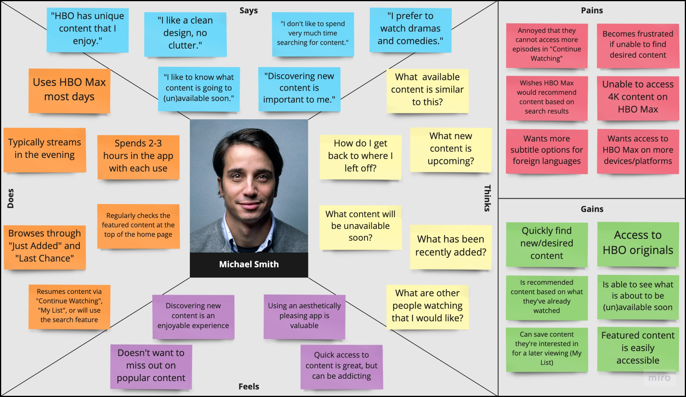
Using qualitative data from user interviews, an empathy map was developed to better understand their needs.
User Persona
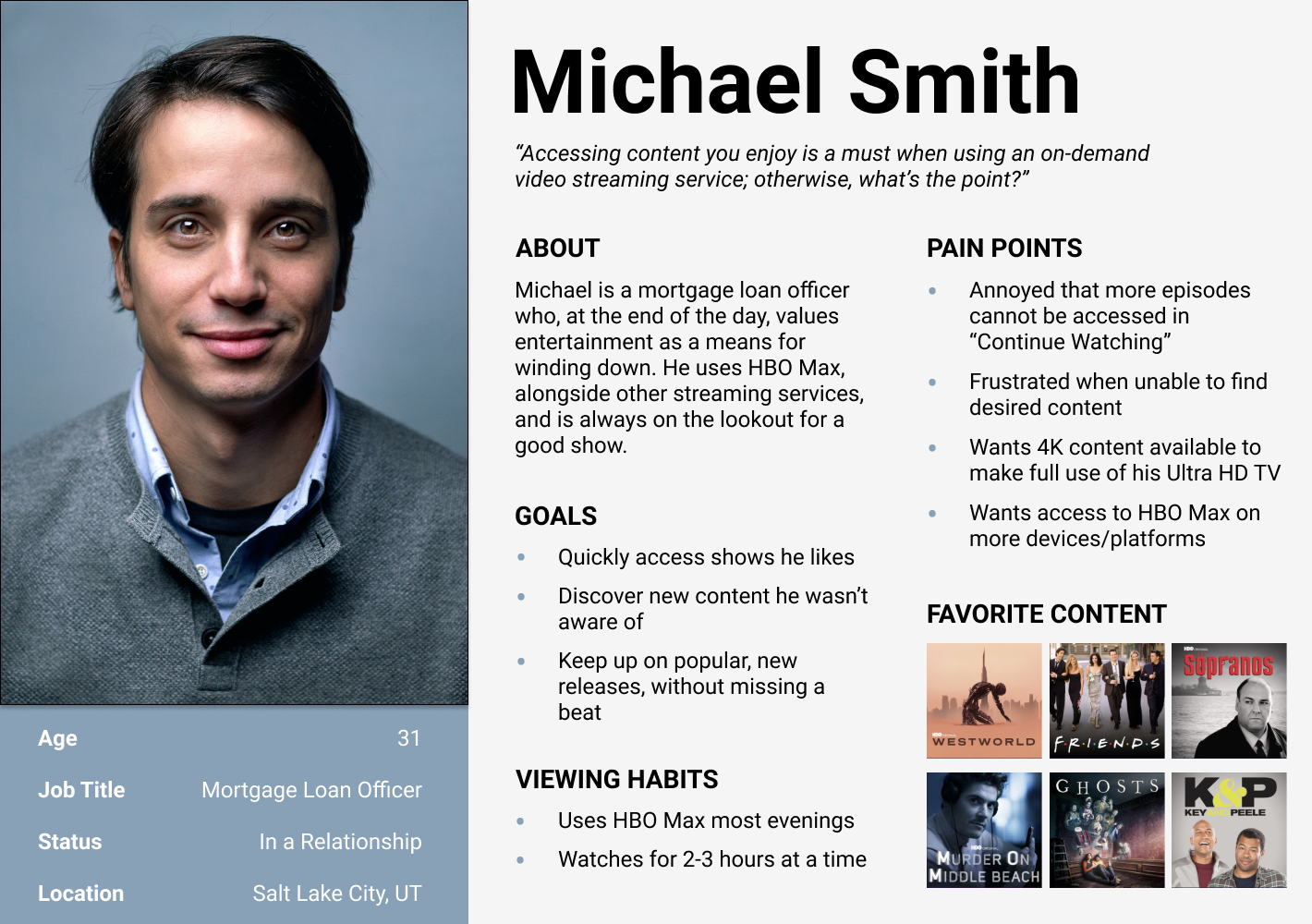
While users of HBO Max come from many different backgrounds, a single persona was created as a way to capture the most general experiences individuals have with the application.
Problem Statement
The insights gained from user research led to the formation of a general problem statement.
Users of HBO Max have reported a lack of features which, as a consequence, makes it difficult to quickly and easily access desired content, leading to confusion and frustration.
Ideation
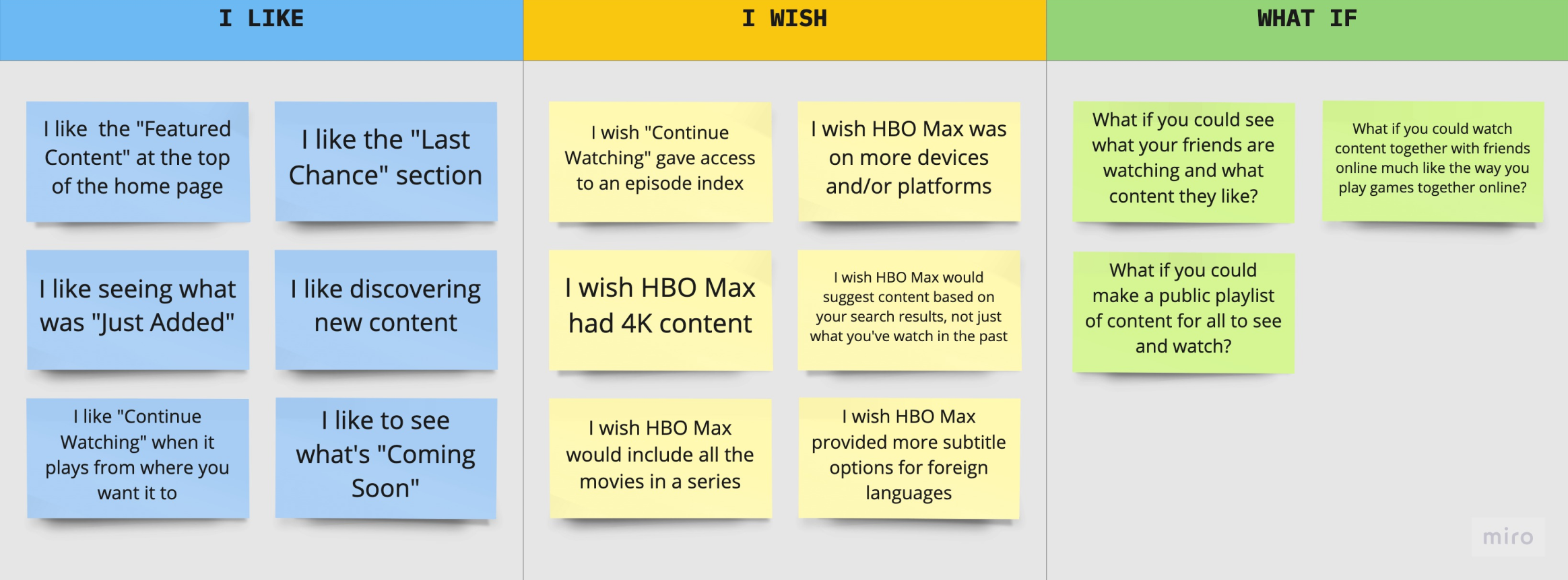
“I Like, I Wish, What If?”
How might we improve a feature and/or process in HBO Max that will afford viewers quick and easy access to content they enjoy? To generate ideas on how to approach this problem, an exercise using the “I like, I wish, what if?” method was performed.
Feature Prioritization Matrix
Possible solutions generated in the ideation exercise were placed into a priority matrix for the purpose of narrowing the scope of the project. The goal was to focus on a single feature/process, which, as a result, would have a high impact for viewers, and at the same time, be simple enough to implement as a solution.
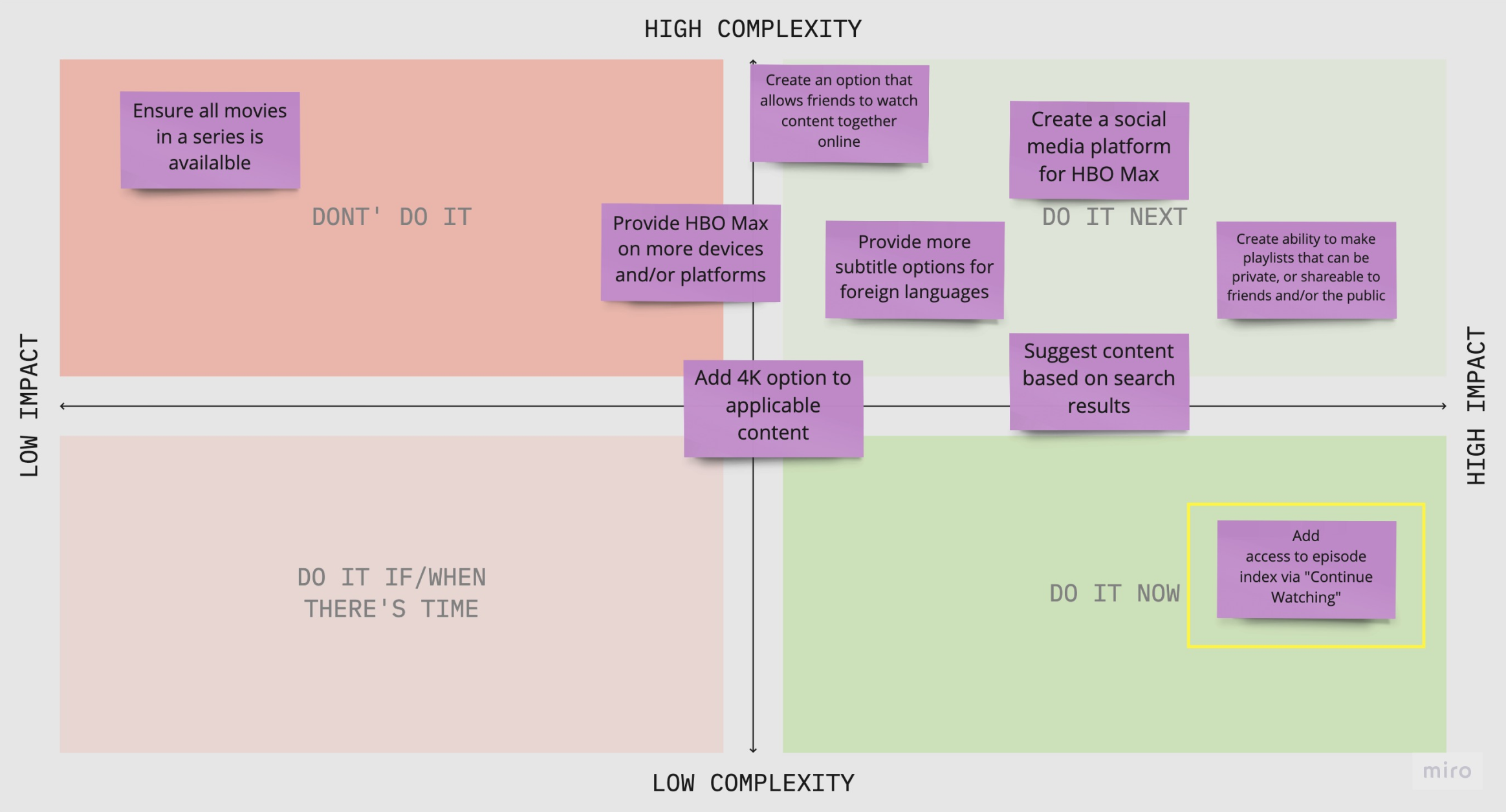
By using this method, it was determined that affording viewers access to an episode index via Continue Watching would be the best solution in terms of high impact and low complexity.
Current User Journey
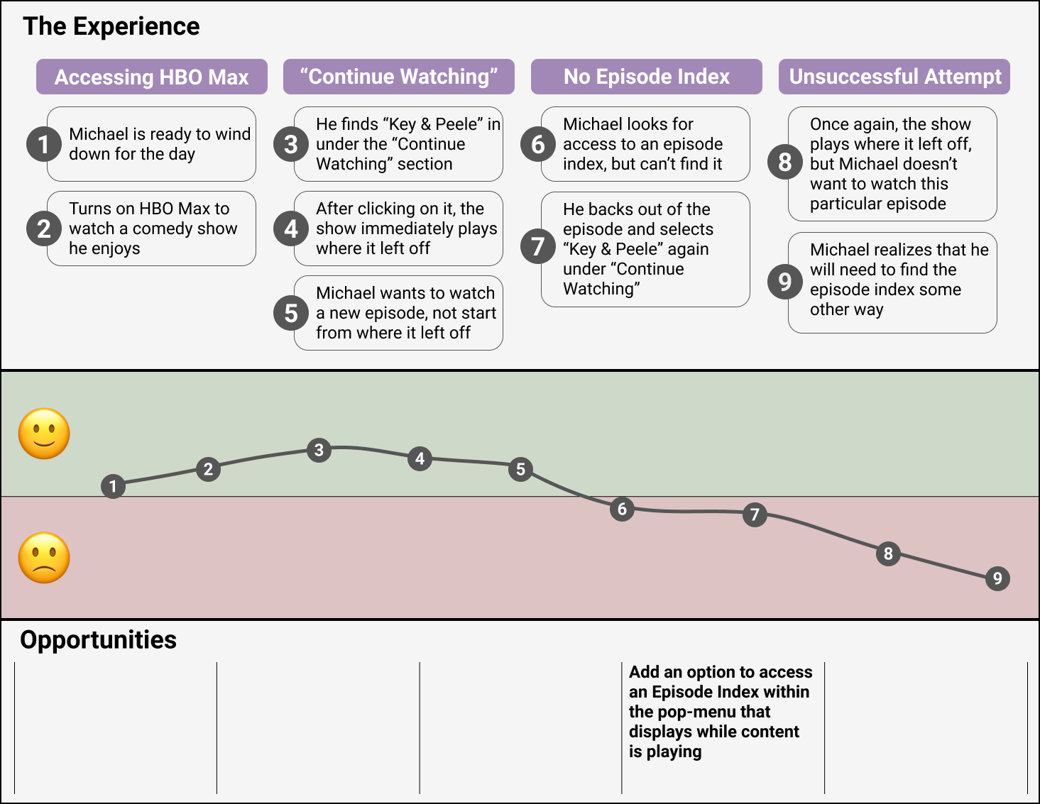
A user journey map showcasing the current task flow was constructed to help illustrate the pain points viewers experience when attempting to access an episode index after selecting desired content under Continue Watching.
Competitor Analysis
A competitor analysis was performed to learn more about how other streaming services deal with this problem.
 2.png)
Key Takeaways:
HBO Max is the only service in this comparison that doesn’t provide access to an episode index via “Continue Watching”
No streaming service (in this comparison) affords ability to bypass an episode index when backtracking episodes
HBO Max is comparatively minimalistic when looking at # of interactable items
Netflix has a lot of clutter that HBO Max should avoid to maintain its minimalism
Design & Prototype
Current User Flow
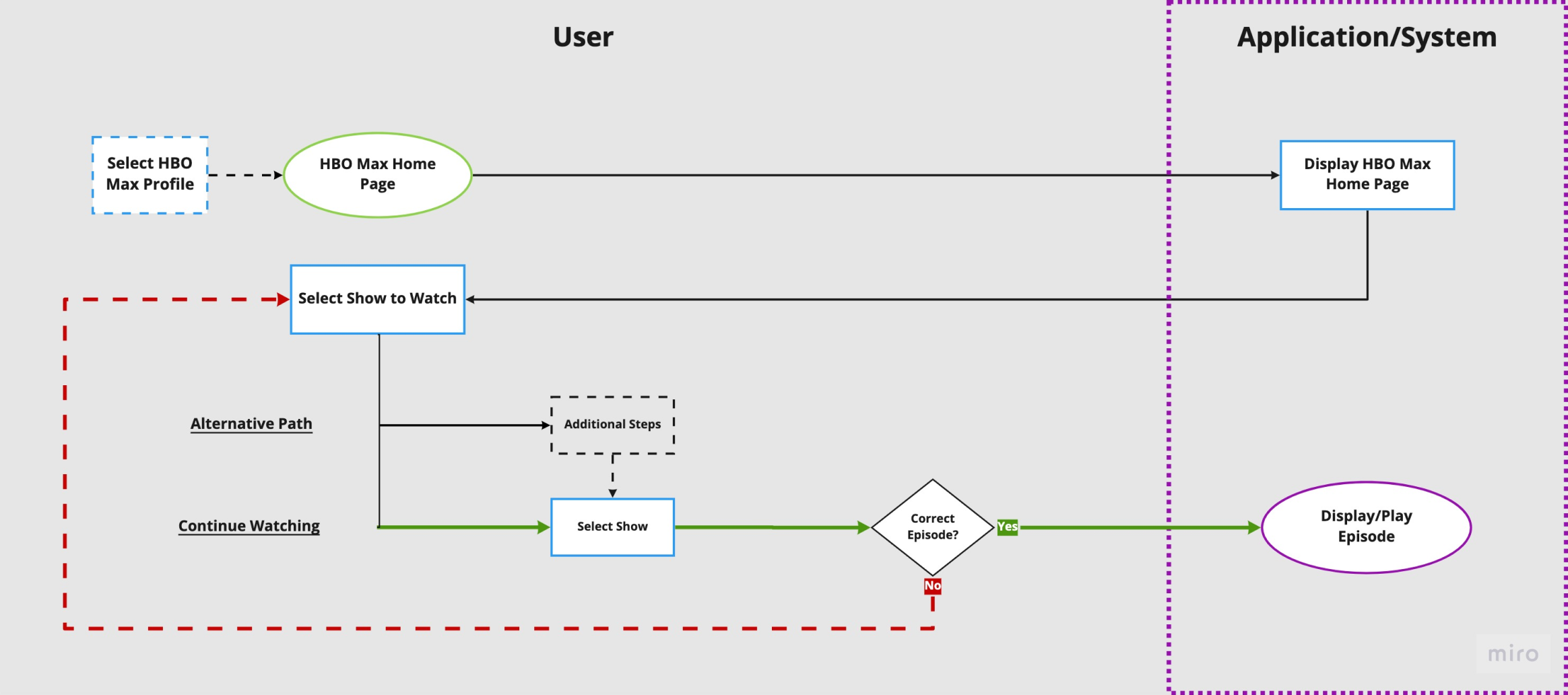
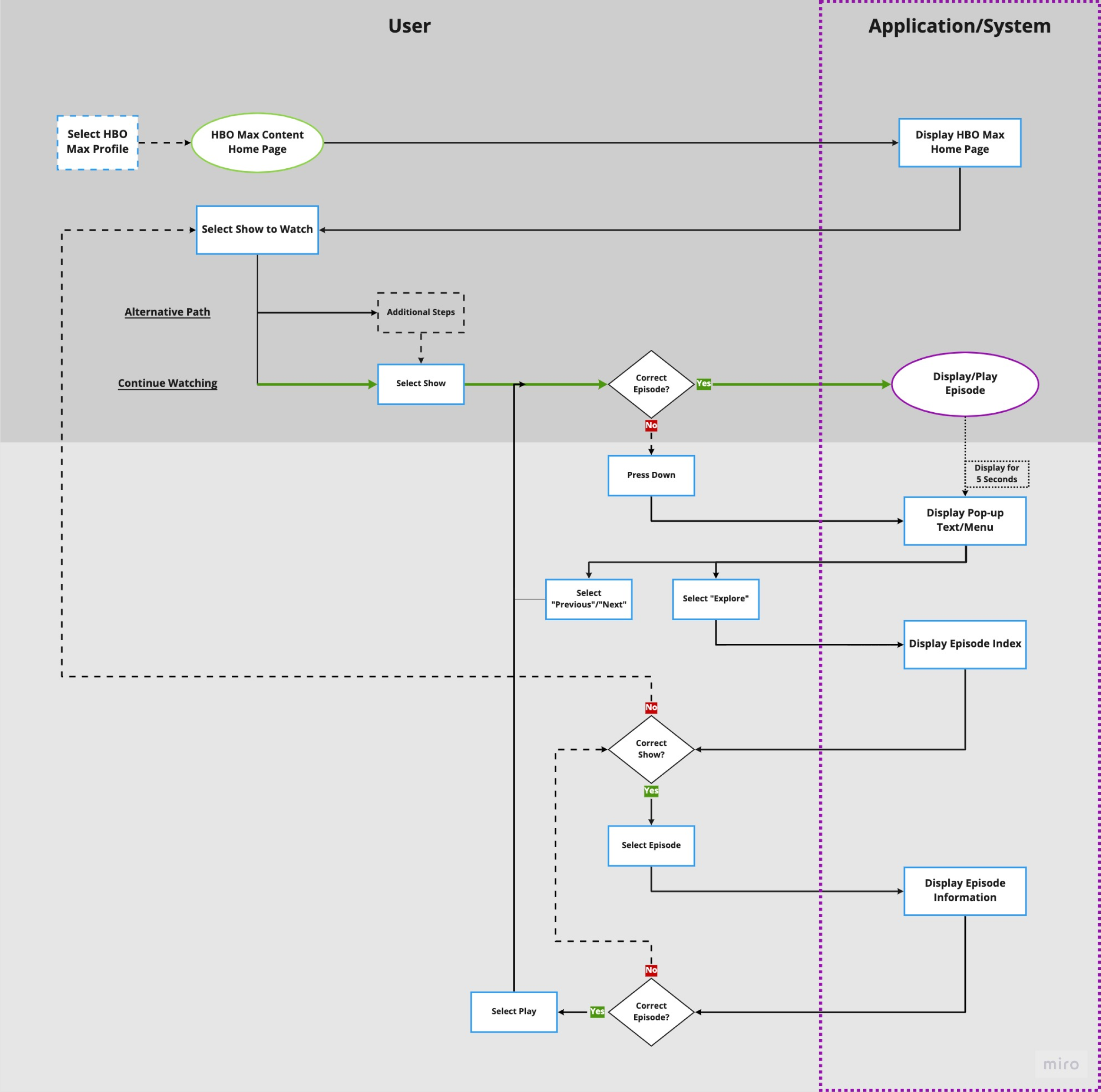
The current User Flow allows viewers to access playable content with only one click under Continue Watching. This route is much easier and quicker compared to an alternative pathway, as illustrated below.
Continue Watching
Alternative Pathways
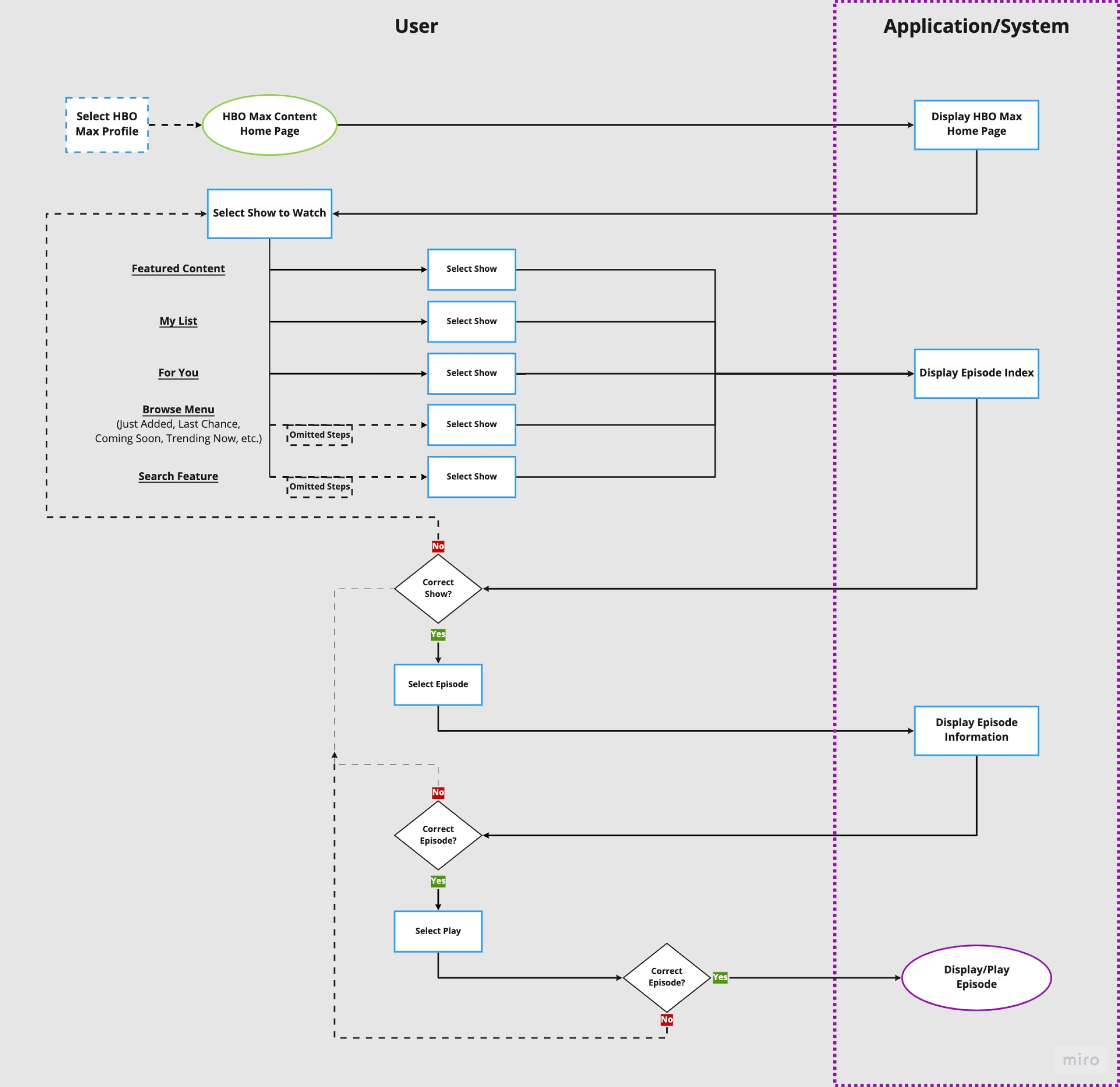
The drawback to accessing content via Continue Watching is if viewers desire to watch a different episode other than the one following their show selection, they will have to go back to the home screen and select an alternative pathway. This has been shown to cause confusion and frustration.
Proposed User Flow
Three Key Features
Maintains one-click access to playable content via Continue Watching
Episode Index is immediately accessible after content begins playing
Affords ability to bypass Episode Index when using the Next / Previous feature
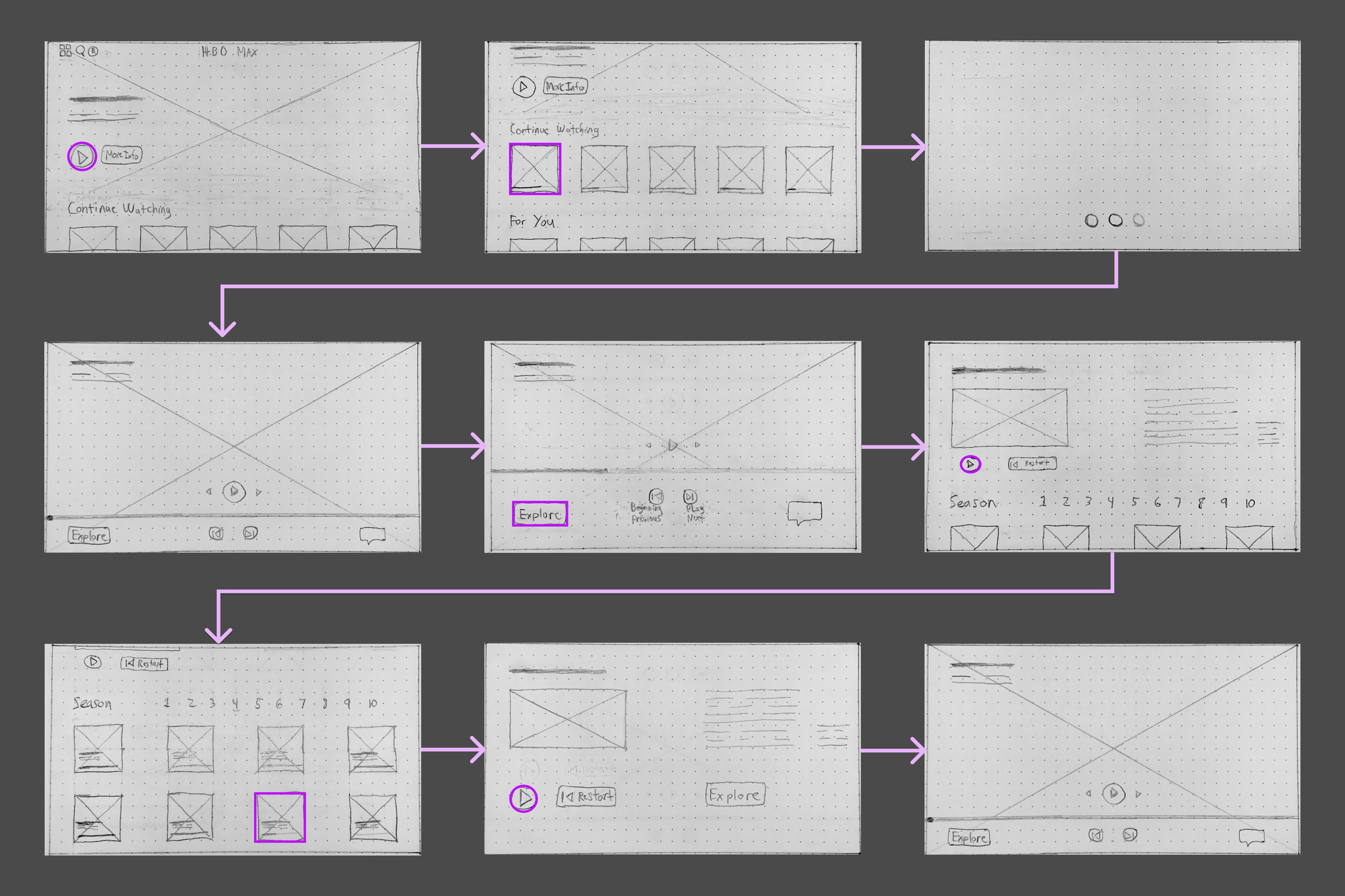
Sketches
Sketches demonstrating the proposed user flow were created.
Low-Fidelity Digital Wireframes
Low-fidelity digital wireframes were designed and prototyped.
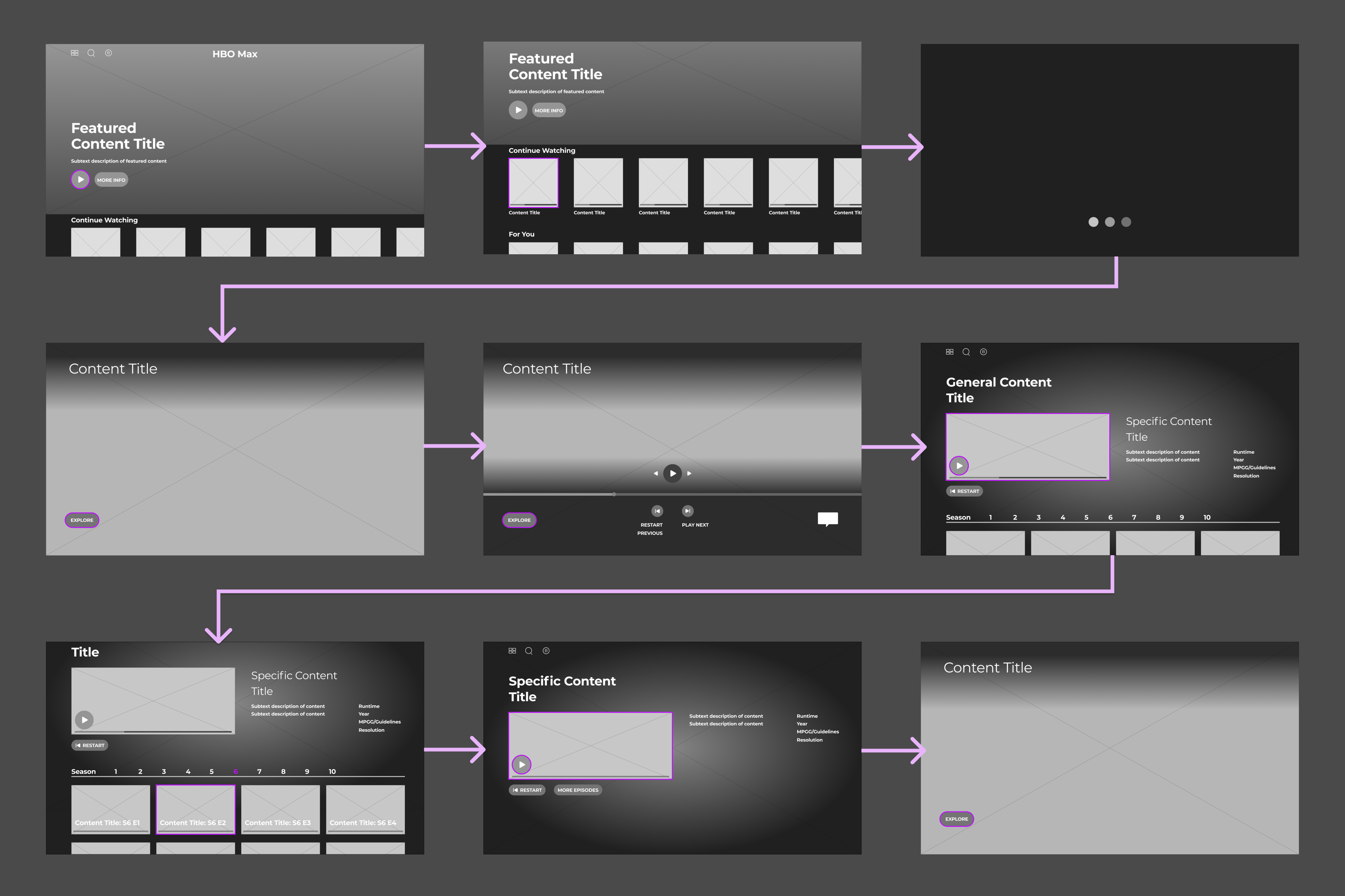
Only three items were added to the pop-up menu interface to maintain HBO's minimalist design.
Explore
Restart/Previous
Play Next

Testing & Iteration
Usability Testing
Four usability tests were conducted remotely via Zoom. Participants were given a quick tutorial on how to navigate the prototype before task prompts were given. They were instructed to use ‘W’ ‘A’ ‘S’ ‘D' on the keyboard to move up, left, down, and right (respectively).
Objective/Goals
Discover if viewers naturally use the Restart/Previous and Explore buttons located in the pop-up menu
Identify pain points viewers experience as they interact with the redesign.
Tasks / Prompts
Task 1: Backtrack a single episode using Previous
You’re one episode ahead from where you left off. Go back to the last episode.
Task 2: Backtrack multiple episodes using Explore / Episode Index
You’re several episodes ahead from where you left off but you can’t remember which one. Find the correct episode.
Task 3: Play from the beginning of the episode using Restart
You’re several minutes into the episode, but you can't remember the beginning. Go back to the start of the episode.
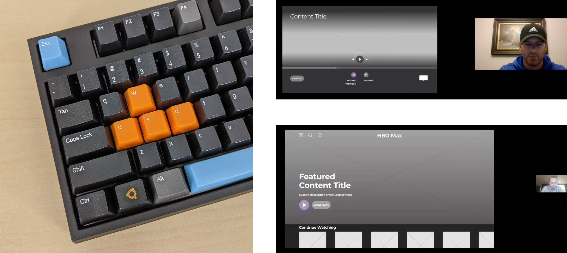
Analysis
An analysis was made on each task.
Task 1: Backtrack a single episode
50% success rate
“Previous” in the load screen wasn’t perceived as a button to some participants
Task 2: Backtrack multiple episodes
75% success rate
“Explore” wasn’t an obvious choice for some participants
Task 3: Restart episode
100% success rate
Some participants thought they pressed the wrong button when “Previous” was shown in the load screen
Participant Feedback
Participants gave general feedback on the tasks and redesign
Having quick access to the previous episode was well received
“Previous” and “Restart” as the same button is confusing
Pop-up menu fades too quickly when not being used
Iterations
The following iterations were made based on testing and feedback:
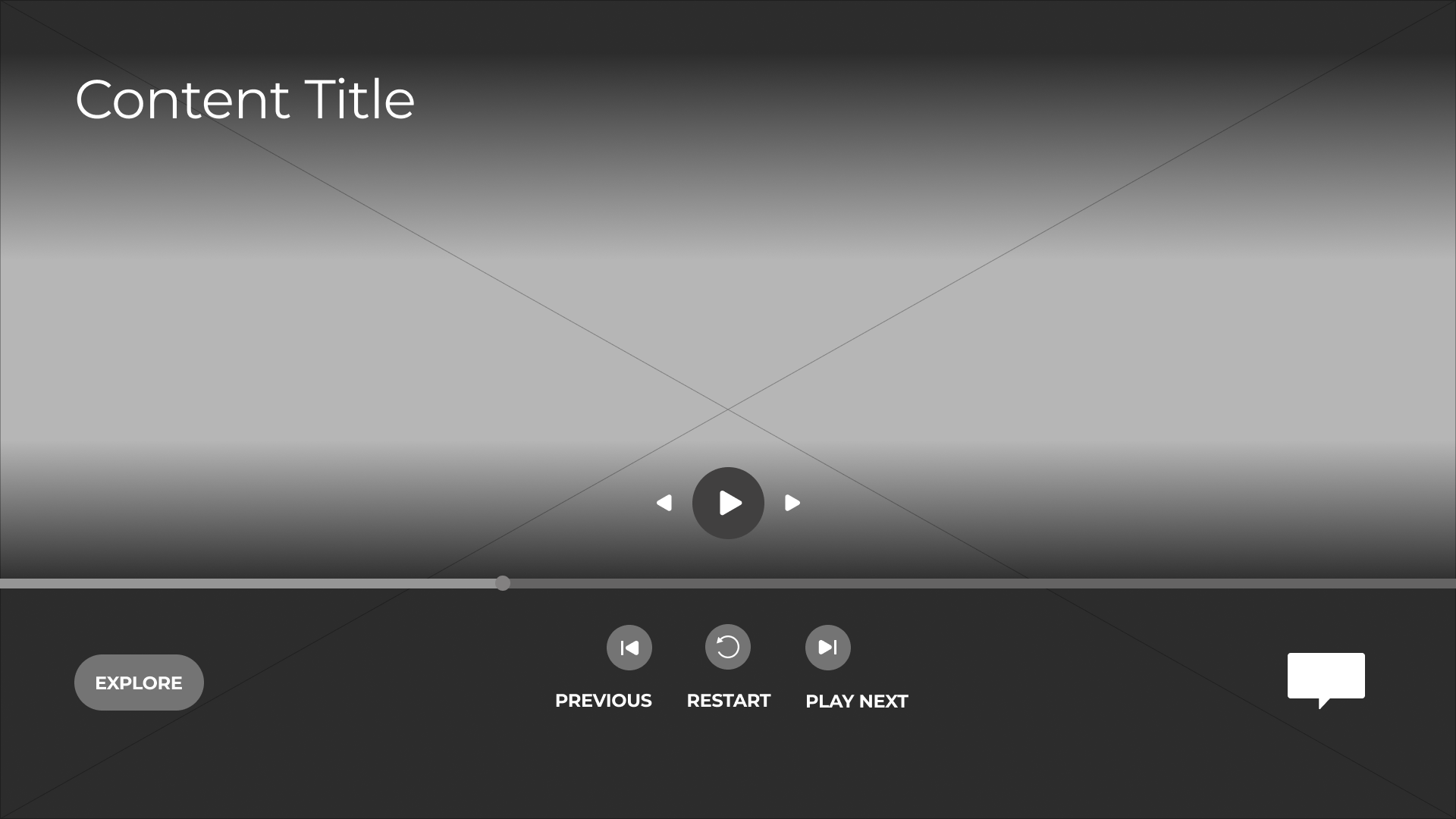
Additional button added to separate “Previous” and “Restart”
Pop-menu only fades after the viewer presses “up” on the controller/remote
Reflection & Next Steps
Reflection & Limitations
I'm NOT the User
My own personal use of HBO Max motivated my decision to take this project on. While I initially considered myself a user, the more involved I became in improving the design, the less I relied on my own experience. I found it was important to defer to others who use the app as a way to better understand the general needs of users as opposed to relying on my own assumptions.
Representative Sample
Participants used for both research and testing were conveniently sampled by turning to those within my network. Consequently, the findings of this project may not generalize to as large of a userbase as hoped. Further research and testing should be conducted to confirm the effectiveness of the proposed design solutions.
Usability Testing: Real-World Setting
HBO Max as a TV app utilizes either a game controller or TV remote for navigating its application. When testing the redesign remotely over Zoom, participants used a computer keyboard for the same actions they would have performed using a controller / remote. It’s possible the results of the usability tests were impacted given this change in interactive medium. It’s important to try and replicate a real-world setting as much as possible to minimize the degree in which this difference could influence performance.
Next Steps
Research & Testing
More research and testing are needed to confirm whether the design solutions in this case study merit further iterations. Steps should be taken to ensure the sample of participants represent the larger user base being targeted.
Additional Features for consideration:
Suggest content to viewers based on their search results
Include more subtitle options for non-English speakers
Add more 4K content
Implement playlists that viewers can customize and share with friends/family